How to Customize Product Cards in Online Stores
Product cards are one of the first things shoppers see when they browse your store. FG Funnels gives you more control over how these cards look. This article covers how to open the product card settings and what each option does.
In this article
Customizing Product Cards in an Online Store
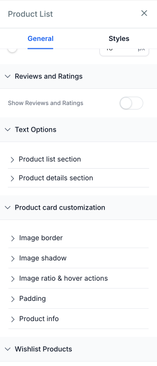
Use Product card customization to style product cards in the Product List, Featured Products and Collection components.
To find these settings, open your store page in the builder and select a supported component. In the General tab of the component settings, open Product card customization.
Your existing product card layouts keep their current or default styling until you change these settings.
Available Customization Options
Image border
Set the border around product images with Thickness, Border color, Corner radius and Border style.
Available for: Product List, Featured Products and Collection.
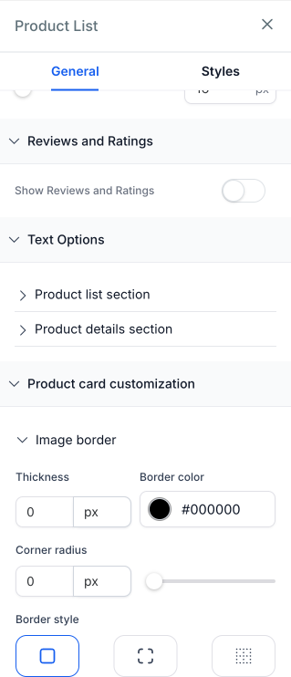
Image shadow
Click + Add image shadow to add an inner or outer shadow to product images, then adjust the offset, blur, spread and color. You can stack up to 5 shadows.
Available for: Product List, Featured Products and Collection.
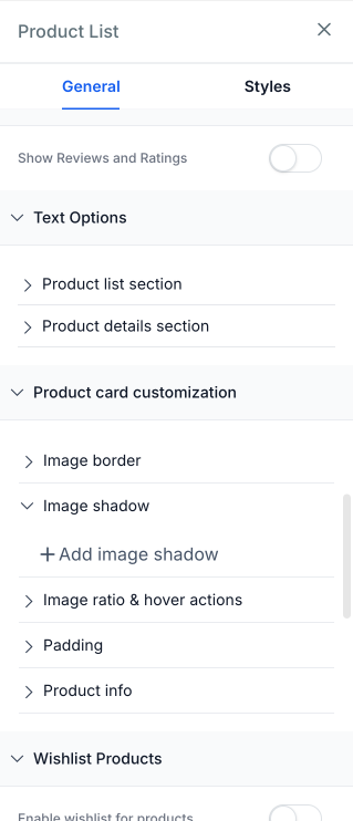
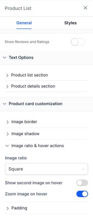
Image ratio & hover actions
Use Image ratio to choose how product images fit in the card: Square, Portrait or Original.
For hover effects, turn on Show second image on hover to swap to the product's second image, or Zoom image on hover to enlarge the image.
Image ratio available for: Product List, Featured Products and Collection.
Hover effects available for: Product List and Featured Products, on Desktop only.
Padding
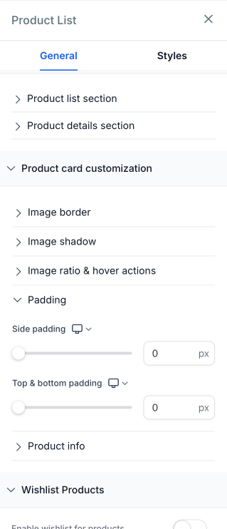
Control the space inside each product card with Side padding and Top & bottom padding. Use the device icon next to each setting to set padding separately for Desktop, Tablet and Mobile.
Available for: Product List only.
Product info
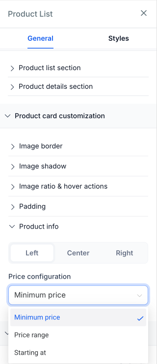
Align the product name, price and other card details to the Left, Center or Right.
Under Price configuration, choose how prices show for products with variants: Minimum price, Price range or Starting at.
Available for: Product List, Featured Products and Collection.